Predicting arXiv Submissions
2016-09-06
My colleague Travis Scholten recently pointed out to me that the arXiv provides usage statistics, including the number of submissions received each month. Travis has taken this data and written a blog post describing some simple modeling of these submission statistics in order to predict when the arXiv will hit the milestone of 10,000 submissions in a single month. This idea intrigued me and I thought it would be fun to try a different approach to modeling arXiv submissions so Travis and I could compare our predictions.
I used Python in a jupyter notebook to do all my work, and have posted a slightly cleaned-up version online for those who would like to follow along in detail.
High-Level Approach
Looking at the raw data, there appear to be large fluctuations month-to-month:
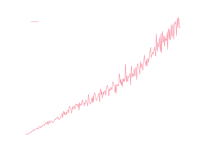
I’m going to assume that most of those fluctuations come from seasonal variations in submissions, so I’d like to model some kind of year-by-year growth of submissions and then modulate that by some model of seasonal variation.
Yearly Modeling
Looking at the number of submissions per year gives data that looks much more predictable:
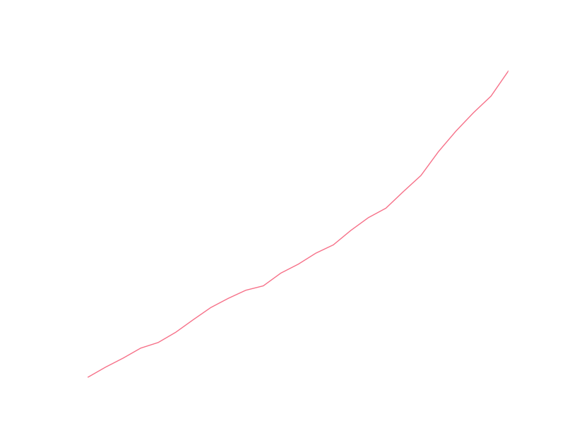
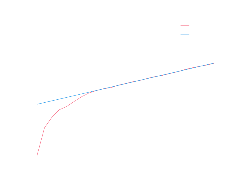
I’m prejudiced to think of growth as an exponential process, and I think I can see some exponential characteristic to the data, at least in recent years. It’s usually easier to visually check linearity of data, so let’s look at the yearly totals with a logarithmic y axis (so that exponential growth will display linearly):

The recent data certainly looks linear, so let’s try fitting the logarithm of the yearly totals to a line. The early data clearly isn’t linear, so we’d like to restrict ourselves to only fitting data after it has settled into exponential growth (we might justify this by saying some different model of growth applied to the arXiv in it’s early years before it settled into some model that is roughly exponential). A crude way of determining when the arXiv settled into exponential growth is to do a series of fits starting at different months and look at some measure of the goodness of those fits. Hopefully there will be a sharp transition from very bad fits to reasonable fits, and we can use that transition point to mark the beginning of exponential growth. As a crude measure of goodness of fit, we will use the R value provided by scipy’s linear regression routine (this is the square-root of the coefficient of determination). Let’s take a look at these R values for various starting months:

The value peaks at 1999, so let’s say that exponential growth starts at 1999 and use the linear fit that comes from all data since 1999. With a logarithmic y scale the fit looks pretty good:
Transforming back to a linear y scale, we can see the exponential fit we got:
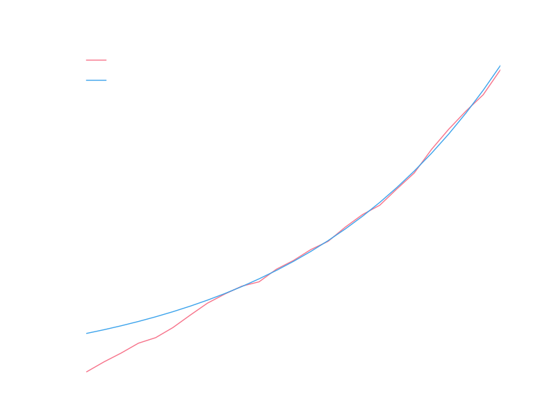
Obviously doesn’t do well for years prior to 1999, but it looks good for recent years, and we’re interested in modeling the near future so we’ll say this is a good model for the number of submissions in a year.
Monthly Modeling
For monthly fluctuations, we might assume that the relative productivity of arXiv authors between months in a given year is roughly constant. This assumption lets us model the number of submissions in a month as a fraction of the yearly submissions, where the fraction is independent of the year and only depends on the month. We can calculate historical fractions of yearly submissions for all months and plot the distributions of those fractions for each month:
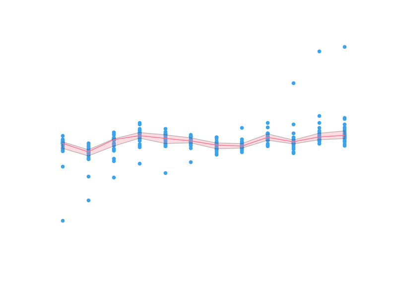
The dots are individual data points. Since it’s difficult to see the finer structure in the regions where the points are bunched up, we shade the inner quartiles and plot the medial with a solid line. The median appears to have significant monthly fluctuations compared to the inner quartile range (which contains half the data), so it looks like we have captured some real quality of the data.
Let’s see how the monthly submissions data looks when compared to our yearly predictions modulated by the monthly fractions:
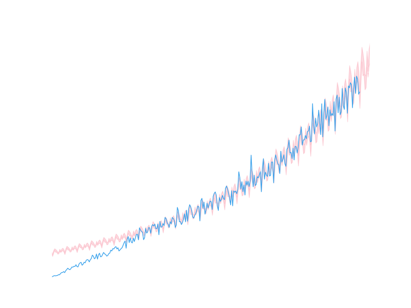
It looks like we’ve captured something of the nature of the real data, but it’s difficult to see precisely in this form. Let’s go back to a logarithmic y scale, zoom in on the most recent period, and draw a line across the 10,000 submissions goal:
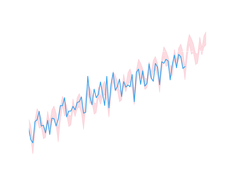
There are certainly a significant number of data points that lie outside the shaded regions, but we do appear to be roughly capturing some of the wiggles.
Making a Prediction
To make a prediction, let’s assume that in future months the number of monthly submissions will be the predicted yearly total times a fraction sampled uniformly from the fractions of yearly submissions the month in question has had historically. This allows us to calculate a probability for each upcoming month to have a number of submissions in excess of 10,000:

The probability that a given month will be the first to have 10,000 submissions will then be the probability that none of the preceding months had 10,000 submissions times the probability that the given month will. Using this, we can come up with probabilities for upcoming months to be the first month to have 10,000 submissions:
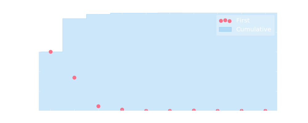
Using our model, we assign a probability of 99.35% that the arXiv will see a month with at least 10,000 submissions in 2016. Now we just need to wait and see what actually happens!